
"Oh My Lord" Said Claudia When She Saw The Horrific Font Choices
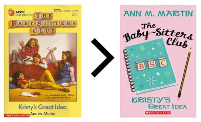
Some of you have pointed me in the direction of this Nylon blog entry, which unveils the new covers for the first few editions of the re-released BSC books. You wanted to know what I think.
Short version: I feel like this.
Long version: I think they are hideous. Heinous. Horrendously ugly. Who signed off on this? Why didn't they call me? Those images are straight off a $5.00 cd-rom of clip art released in the mid 90's. And the fonts! The FONTS, people.
Short version: I feel like this.
Long version: I think they are hideous. Heinous. Horrendously ugly. Who signed off on this? Why didn't they call me? Those images are straight off a $5.00 cd-rom of clip art released in the mid 90's. And the fonts! The FONTS, people.
I guess I should congratulate them on not using Comic Sans. Way to go, design team.
Seriously, I'm baffled at their decision to do away with the original block letter logo. If they wanted to argue that the illustrations were dated, I'd be able to nod ruefully. I'd give them that, even though I'm sure we all feel that's part of their charm. But that logo is a total classic. Do I think this cover will impact the buying decisions of, say, an 8 year old? No, of course not. But I'd be surprised if many of the original readers end up reinvesting . . . the nostalgia factor has been totally done away with. Like sparkleneelysparkle said:
"These aren't bastions of fucking literary glory. They’re books about teenage girls. and I am sad that we have to fucking SPOON FEED them to you so that they are relevant to your lives (OMG WHATS A WALKMAN????) the only thing that is cool about them is that they are a snapshot of what people read in the 80s and 90s."You really screwed the pooch on this one, Scholastic.


24 comments:
word.
I feel even worse than I did when I saw the redesigned Rainbow Brite and Strawberry Shortcake.
the renegade bean
The handwritingy font is just awful, and the first cover is pretty damn lazy. But I have to admit, I kind of like the third one: it has a sort of '60s, almost Mad Men feel to it. (Admittedly, putting a '60s-style cover on a 2010 reissue of an '80s book makes no sense at all.)
Not cool, Scholastic, not cool.
Fail.
I'm an elementary teacher and was thinking I would purchase the redesigned ones when they became available... Alas, looks like it is time to start scrounging around at thrift stores for 'classic' copies for my classroom.
Sigh.
I don't think that the barf cover itself will be enough to spurn all the original fans, but... yeah, pretty barf. I agree, it's so lazy that I'm surprised that Scholastic couldn't hire a design team decent enough to know that lavendery pink with a notebook and pencil with cheesy font is boring. :/
Sigh, Claudia wouldn't like this.
http://charmalade.blogspot.com
Ugh....I hate the idea that I'm getting these for my niece's ninth birthday and we won't be able to bond over the covers!
I'm glad someone else out there is unimpressed with Scholastic's "reboot." You know, when I dug my dad's books out of my grandmother's basement as a kid, I spent weeks puzzling over what in the world a "jalopy" could be, and why did the Hardy Boys care about Chinese junk? AND I WAS DAMN HAPPY TO DO IT. UPHILL. IN THE SNOW. BOTH WAYS. NOW GET OFF MY LAWN.
Seriously, though. I'm glad someone eise is unimpressed by Scholastic's idea of a renewing the series, and saddened that they think so little of the current generation of kids.
I didn't realize that Scholastic was using MS Paint for cover art these days.
Tsk, tsk.
I agree with you entirely. These covers are awful, they look cheap and they have a definite mid-nineties clip art feel to them. While I love the idea of the books being re-released I really don't dig the updated language - I feel they should be left alone as examples of a time and a (admittedly fictional) place. Too late now I guess.
Damn Scholastic, why you gotta do me like that?
On the plus side, I'm visiting my parents and found some old BSC books stowed away. They remain fantastic.
Olive
www.VisforOlive.blogspot.com
Barf. Horrible cover.
Was there a contest for how many typefaces and alignments they could cram into one book cover?
Hey, design students. When your teacher asks you to bring in an example of a "bad design", look no further than the re-released BSC books!
Oh. My. God. WHY.
oh my gosh! i LOVE the BSC!! have they been reprinted??? do you know where I can get them? :DD
ughh gosh the new cover is hideous though!! why didn't they just keep everything the same?!
As an artist and an old school BSC lover I HATE that cover. Were I the age market these books were aiming for, I wouldn't buy it because nothing about it looks interesting. Having the girls on the cover and acting like teenage girls made me interested in it back in the day. This is a bad marketing move, Scholastic...what happened, you guys used to be GOOD publishers. This isn't even going into the fact that it just looks cheap.
I go to Ringling College for Illustration and my painting teacher, Hodges Soileau did all the illustrations for baby sitters club!!! He brought in all the originals and they are amazing! He's in his 60's, and he has since stuck to painting personal interests but I'm sure he's happy to know his work reached so many people. He has the originals just sitting in his basement so maybe you can email him about getting some! just letting you know..
http://hodgessoileau.com/blog/ << check it
I've just discovered your blog and have spent the past hour reading old posts. I was obsesssed to BSC as a kid (especially Claudia) so I'm feeling an effinity here. Wonderful writing too!
The Heartbreak
The original cover were way cuter. They shouldn't be messing with the books anyway. How else will people know to have crushes on lifeguards at the shore?
ugh, those new covers are horrid. I have a seven year old and she is getting into the BSC. I spend time scouring Op Shops for them. i dont think i would bother buying the new ones.
thank God people are selling their used copies on amazon---the new ones are awful. i need to reread all my favorite bsb books again after finding your blog! i love the halloween one where dawn's in california (no claud, but lots of health food and celebrities!). BSB mystery #17
Oh my gosh... I'm only 11, but when I was 8 or 9 my mom gave me some of her books and I was hooked on them. I love the old covers! Those new ones are hideous!
Really trustworthy blog. Please keep updating with great posts like this one. I have booked marked your site and am about to email it to a few friends of mine that I know would enjoy reading
Sesli sohbet Sesli chat
Seslisohbet Seslichat
Sesli sohbet siteleri Sesli chat siteleri
Sesli Chat
Sohbet Sesli siteler
Sohbet siteleri Chat siteleri
Sohbet merkezi chat merkezi
Sesli merkezi sesli Sohbet merkezi
Sesli chat merkezi Sohbetmerkezi
Sesli Sohbet Sesli Chat
SesliSohbet Sesli chat siteleri
Sesli sohbet siteleri SesliChat
Sesli Sesli siteler
Seslimuhabbet sesli muhabbet
sesli sohbet sesli chat siteleri
sesli sohbet siteleri sesli chat
seslisohbet seslichat
seslikent sesli kent
sesli sohbet sesli sohbet siteleri
sesli chat sesli chat siteleri
seslisohbet seslichat
Scholastic: Thanks, but no thanks. I'll keep my old covers, thank you very much. NOT.
Post a Comment